Payment page design gives customers the opportunity to enter payment details and complete their order. The checkout process will gather a customer’s shipping details, billing details, shipping method, and payment method, and offer an option to submit the order. You should continuously improve your payment page, optimizing to make it faster, more efficient, and as frictionless as possible. Creating a convenient, easily accessible, and high-performing checkout will improve the buying experience for customers, cutting down checkout abandonment, and improving conversions. This article will guide you on how to create a winning payment page design to maximize sales.
How important is the payment page design?
All eCommerce websites need a good checkout page design. The payment gateway is a platform that enables shoppers to pay you through the use of debit or credit cards. Even though the payment gateway may be efficient, it is not enough. Not having a good payment page design means customers may not end up paying for products. Instead, they will leave your online store without buying anything.
Most businesses more focus on the first page and overlook the importance of checkout page optimization. Store owners fail to realize the need for a payment page. According to Statista, 45% of Americans feel satisfied when they finish the checkout process. So, designing an effective checkout page is very crucial. Here is some reason why optimizing your payment page is necessary:
- You can collect customer contact info
- Enhance retention of customers
- Increase your sale
- Increase customer conversion
- Improve UX
But, how do you tell if your payment page is optimized? To answer this, you have to make sure your eCommerce store has the following:
- Quick processing
- No distractions
- Multiple payment methods
- A good UI
How to create the best payment page design?
Look at some of the best examples which show you with the knowledge of how to create the best payment page design. A good UI should be smooth and make it easier for visitors to navigate through your online store. Here is a list of excellent payment page design examples that can work as a guide for you.
1. Allow guest checkout
Studies have concluded that 25% of online shoppers abandon their carts if it forces them to create an account during checkout. A workaround for this issue is a guest checkout option that simplifies the checkout process.
2. Minimize the Clutter
Your checkout page should be neat and simple without any unnecessary elements or distractions. 25% of eCommerce shoppers do not complete the purchase due to the long checkout process.
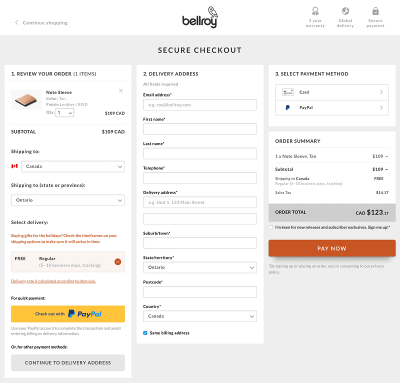
This reflects the importance of a short and fast checkout process. The following tips will help you achieve this idea:
- Highlight the compulsory fields using asterisks.
- Product categories, latest offers, and latest deals can distract the customers, thereby leading to an incomplete purchase.
- Your form should be short.
- Highlight features like free shipping or easy returns policy.
- Your customers should be able to modify the products in their cart or change the quantity.
- Use breadcrumbs that display the entire checkout process and show their journey to the store. For example Login — Delivery information — Billing details — Review the order — Payment — Confirmation
3. Prioritize mobile-friendly design
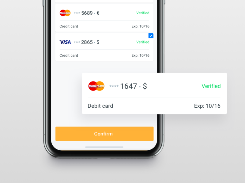
50.5% of online shoppers are mobile users and your payment page design process should reflect this change. When creating, designing, and optimizing your checkout, you need to prioritize mobile-friendly design to make the checkout seamless for your customers as well as uniform across all device types. You should use color contrast for different call-to-action buttons for mobile-friendly navigation.
4. Offer A Progress Indicator
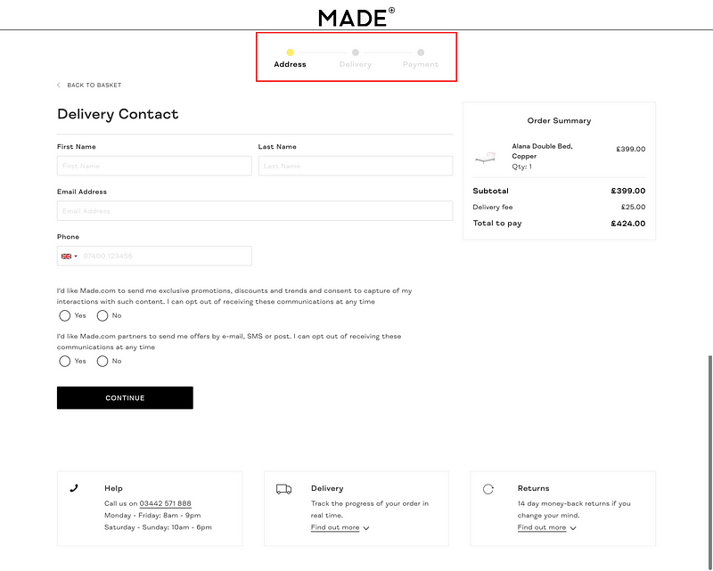
Checking out is often a multi-step process. This means the shoppers will have to move several pages before the order is complete. To make this process easier, you should add a progress indicator that says exactly at what stage of the checkout process the customer is right now and how long there is left to go
5. Accept multiple payment options.
Do not force users to fill out long payment forms and type their addresses. Instead, you’ll likely convert more online shoppers by using the online popular payment services for secure checkouts, such as Stripe and PayPal.
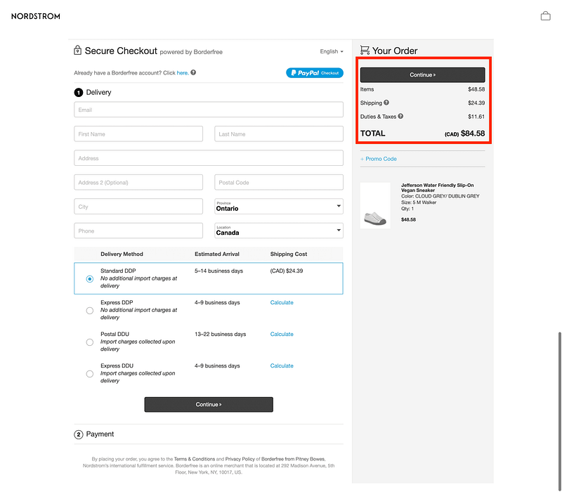
6. Don’t surprise customers with additional costs
Adding unexpected costs at the time of purchase makes customers second guess the value of the purchase and whether they want to proceed. Instead, you can provide as much information — such as shipping fees, taxes, and any other costs — upfront so shoppers are aware of the full cost prior to entering the checkout.
7. Display trust signals and badges

Your payment page design should prominently display trust signals, badges, and seals to bring customers peace of mind during checkout. Showcasing these throughout checkout gives customers confidence in the platform they are using and the security it offers. If customers do not feel their financial and personal details will be kept safe, they are unlikely to make a purchase in your website
8. Connect users to customer support
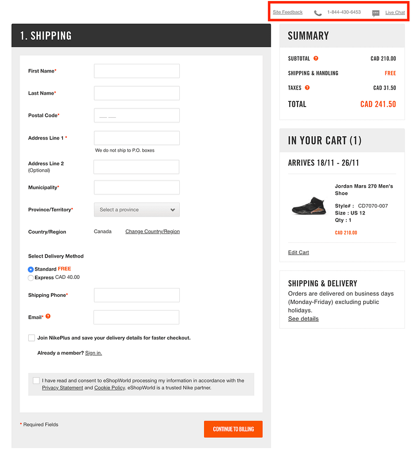
When you’ve identified common areas where assistance is required during the checkout process, add customer support options to your payment page design. Find the resource that best support customers — whether that’s a knowledge base, a call center, or a live chat — and connect customers with support where they popular experience problems. This allows you to remedy these problems as they appear, and keep your customers on track to purchase. A great method to solve this is to trigger a chatbot on visitor inactivity to support the customer.
9. Offer a one-page checkout
If simplicity is the key element of the payment page design, reducing to a single page checkout is an effective way to make the payment process easier and frictionless; a one-page checkout makes it effortless to isolate the checkout process. In general, one-page checkouts cut down checkout abandonment by having fewer steps, being easier to follow through, and taking less time to finish.
10. Add checkout buttons to make paying ultra-fast
Assing the checkout buttons for nearly instant or express checkouts are a great way to optimize the payment page design and make it easy, fast, and efficient for customers. This requires customers to be members with existing customer info, but this can save recurring shoppers time and effort on each purchase they make.
The payment page design is an important part of the website design. It can determine whether customers will buy your products or services. Hence, there is a need to design a page that improves the customer’s shopping experience. If you’re looking for better results from your website but don’t know where to start, contact us! we’ll evaluate your website (including your check-out process!) and look for key areas of improvement.
Besides, if you are looking out for a cost effective Magento package for your eCommerce store, then look nowhere other than Magesolution. We not only offer an affordable Magento Development Package for all size and budget but also ensure that it helps your online business grow and sustain. Contact us for a free consultation!


