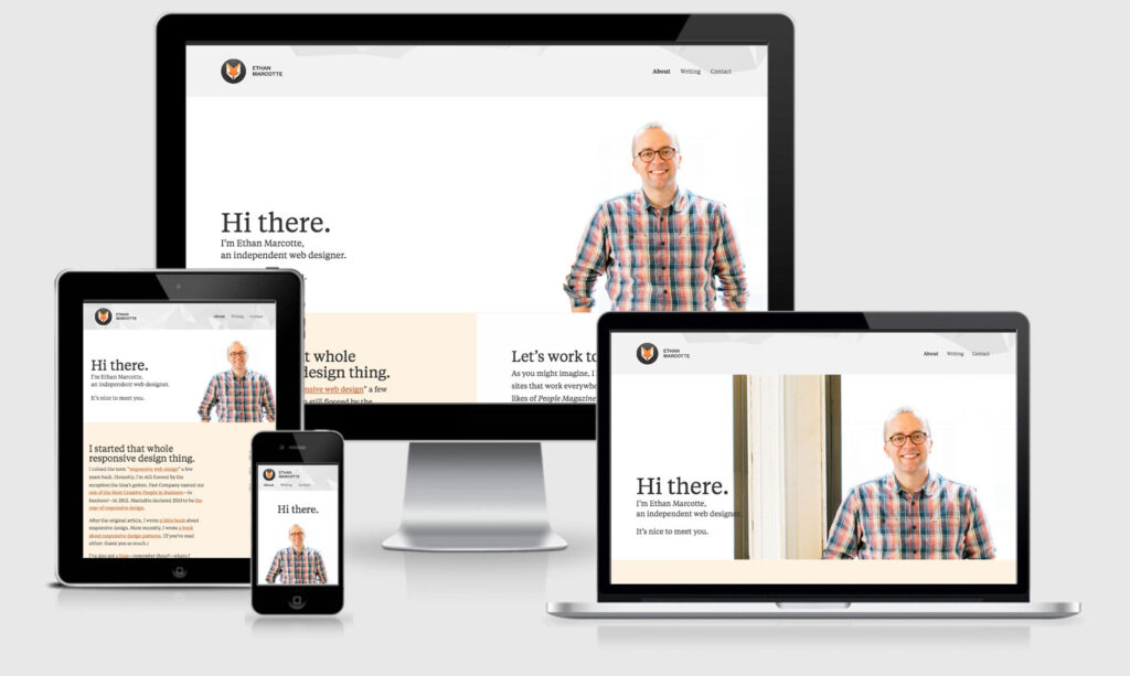
Responsive website design refers to a website designed with mobile-friendly functions, content, and media. Responsive websites change and adjust to whatever device a user may be using such as smartphones, tablets, and desktops. Responsive web design is no longer a recommendation, it’s an essential investment to build your brand awareness, improve your user experience (UX), and boost conversions.
From a technical standpoint, responsive website design is based on percentages. A responsive web design company assigns adjusting percentages to the proportions and dimensions of elements on the website such as images, columns, and text boxes. Thanks to the percentages they assign to these elements, the layout of the responsive website automatically makes adapting and scales everything on the original website to fit a user’s device screen
1. Why is responsive website design crucial to your business?
Responsive website design ensures relieves web designers, user interface designers, and web developers from working day and night building websites for every single different device in existence. For the business owners, it allows you to reach a broader, more engaged audience wherever and however they choose to browse.
Here are the top advantages:
- Optimal design for the device: With the responsive web design approach, all images, fonts, and other HTML elements will be scaled suitably, maximizing whatever screen size the viewer has.
- No need for redirects: Other options towards designing for multiple devices require the use of redirects to send the viewer to the suitable version of a website. Without the need for redirects, the viewers can access the content he wants to look at, as quickly as possible.
- Keeps users on your website longer: Website bounce rates on smartphones are almost 42% (compared to only 26% for tablets). Also, a web page that loads in five seconds or fewer guarantees 75% longer viewing sessions.
- Improving your Google rankings: Its mobile-first indexing can actually impact how your website ranks and can cause it to be bumped down on search engine results pages (SERPs) in favor of websites that bring the users a mobile-friendly design.
- Builds positive brand recognition and trust with consumers: 57% of shoppers say they’re not likely to recommend a business with a poorly-designed mobile website
- Save time and money: Responsive website design is also effective from a price standpoint. It helps you to manage a website easily because it’s one site versus two. You don’t have to make changes twice. Instead, you can work from and update a single website.
2. How does responsive web design work?
A responsive web designer will use a mix of layouts and flexible grids, use of CSS media queries, and images. When a viewer changes from a larger screen to smaller ones of a mobile phone or iPad, the responsive websites will automatically adjust for resolution, scripting abilities, and image size. Thus, the website designer uses technology that automatically responds to the preferences of the viewer’s device.
The developers use different techniques such as flexible layouts, flexible grids, media queries, etc to create Responsive website design
- A Fluid Grid System: This is an intuitive, responsive Cascading Style Sheets (CSS) grid system with 24 columns that feature browser support. It helps you to save time and money by allowing designers to update one version of the site versus many
- Flexible Images: These are also referred to as adaptive images. Sizing considerations that would not be necessary for images to appear correctly on a fixed display size become necessary for mobile websites.
- Media Queries: This is a module that enables content to adapt accordingly to screen resolution.
By utilizing three technical ingredients, a responsive website development company can utilize responsive web design testing to make sure that users have the best possible browsing experience.
Related Issues
Mouse v. touch: Designing for responsive website design also brings up the problems of mouse versus touch. On desktop computers, the visitor commonly has a mouse to move and choose items. On a smartphone or tablet device, the user mostly is using fingers and touching the screen. What may simply choose with a mouse, may be difficult to select with a finger on a tiny spot on a screen.
Graphics and download speed: Also, there’s are some graphics, ads, and download speed. On mobile devices, it may be necessary to display fewer graphics than for desktop views so that a website doesn’t take forever to load on a smartphone. Big ad sizes may need to be exchanged for smaller ads.
Apps and “mobile versions”: In the past, you might have thought about building an app for your website — say an iPad app or an Android app. Or you would have a mobile version specifically for BlackBerry. But with so many different devices today, it’s getting more difficult to create apps and various versions for every device and operating platform.
3. How to Make a Responsive website design
It is possible to create your own Responsive website design with CSS and HTML. But this is like taking lengthy backroads when an expressway is available. In this case, the expressway would be a CMS platforms or a website builder. A CMS ( content management system) is a software that helps you to create your website without coding knowledge that includes knowing how to code for responsive design. Responsive website design can be achieved using either a CMS or site builder that facilitate responsive designs. Here are a few common choices.
Magento
Magento is an open-source E-commerce CMS and a search engine optimization friendly platform. It is a very responsive platform for the website to work with the perfect quality on both PCs and mobile devices. One of the easiest ways to customize the look of your Magento eCommerce store is with Magento themes. You can even download responsive Magento themes for free, which are optimized for all devices from PCs to smartphones
WordPress
WordPress is the world’s most popular CMS and maintains this superlative by providing one of the most straightforward website builders. WordPress comes with thousands of themes and templates with responsive design. (Find more responsive WordPress themes here )
Squarespace
Squarespace is a popular site builder that comes with attractive site designs and powerful tools. Squarespace provides 65 mobile-optimized templates. Within the Squarespace editor, you can also transition from desktop to tablet to mobile view to ensure your designs seamlessly respond to different devices.
With so many consumers shopping and browsing on their mobile devices, responsive website design is an absolute must-have for your eCommerce business. Without it, you could be missing out on leads, customers, and revenue. Get started with responsive web design today.