Website color schemes is an important and exciting aspect to create! Color is a key component of your business’s branding. It also helps communicate important messaging to users as they interact with your site. Because of this, website color schemes should always be carefully planned and tested.
There are lots of best practices and elements of website color schemes you should consider before implementing something new on your site. We will introduce them in this blog.
Latest Update: We’ve just released version 2.0 of Claue Multipurpose Magento 2 Theme with a bunch of performance improvements and exclusive features. Check this theme out now: Claue Magento Theme 2. 0
Claue – Clean, Minimal Magento 2&1 Theme is an excellent template for a modern and clean eCommerce store with 40+ homepage layouts and tons of options for shop, blog, portfolio, store locator layouts, and other useful pages. Claue version 2. 0 comes with a bunch of exclusive features including:
- Being based on the Luma theme.
- Meet all standards of Magento Theme
- Significant performance improvement
- Compatible with most third-party extensions.
- Fully compatible with Magento 2.4.x
This second advanced version completely differentiates from its previous one. Thus, if you are using Claue version 1 and want to update to Claue version 2, you can only rebuild a new website no rather than update from the old version. Now, let’s get back to the main topic.
“How to think about website color schemes & your brand?”

Before choosing any colors or schemes, you need to have a deep understanding of your brand and the users interacting with your website.
Having an infinite color palette and the ability to choose options that represent a brand makes this an exciting part of the web design process. The brand should always be the main focus when creating website color schemes.
Advice for new brands: For new brands (or an existing one going through a full redesign), there may not be existing color guidelines yet, especially if the website is being created for the first time. If the brand guidelines need to be established, it’s important to consider the color scheme before fully launching the website. You can always test and change things later, but it’ll help to review mockups of the color scheme first before actually building it out.
Create your own website: Magento Themes List
Identifying your target market and how they’ll respond to website color schemes
This is the most important research to do before developing your website color schemes. Color is very subjective. So you might find yourself geared toward colors that you like or that are trendy right now. But it is important to consider the site visitors first and not focus on personal color preferences.
Consider who your target audience is and what needs they have. For example, are you targeting an older demographic? If so, making sure that they can easily view the content is absolutely key. Color contrast, larger text (maybe even bolder as well), and clear indications of actionable items should be planned out in the design process. If your audience is younger, a visually interesting color palette that is bright and playful will help them stay engaged. The content of the site will also need to be engaging, but color will play a big role.
Remember to keep an open mind and let the research inform your final color decisions.
Color psychology

When deciding a website color scheme, remember to be mindful of color psychology and the effect color can have on the emotions of your site visitors. Even it is not a requirement to follow color psychology, it can help you focus on the message and feeling you want your site to convey.
Overview of color psychology, and what different colors mean:
- Red: A bold color that evokes a strong emotion. With its intensity, it creates a sense of urgency.
- Orange: Cheerful and confident, orange conveys the idea of enthusiasm. However, it can come off as the color of caution as well.
- Yellow: Like orange, yellow provides a cheerful feeling. It represents optimism and is usually attention grabbing. One thing to consider, however, is that some shades can strain the eye.
- Green: Represents growth and nature. It signifies health, serenity, and tranquility. It is associated with wealth.
- Blue: This color is associated with water, and provides a feeling of calmness and serenity. Blue creates a sense of security and trust, and is often used for corporations.
- Turquoise: Sophisticated and also associated with healing.
- Purple: The color of wealth and success. It’s a powerful color, but also represents creativity.
- Brown: Friendly, earthy, and commonly represents the outdoors.
- Black: A color with a sophisticated feeling. It’s often what we think of with “sleek” brands because of its exclusivity and mystery.
- Gray: Provides a feeling of security, reliability, and intelligence.
- White: Provides a clean or neutral feeling. It’s a key color because it adds breathing room and what is referred to as “white space.”
Note: This is written from a US perspective. When designing globally, be sure to do your research because colors will have different meanings in different parts of the world.
This is a very condensed explanation of color psychology, but should give you a good place to start.
How to choose your website color scheme
Now that you’ve thought about all the context of colors, the next step is to start with the key brand color; the “primary.” Once that’s defined, you can start thinking about the secondary colors.
The final number of colors in your website scheme will vary from brand to brand. But choosing three is a good place to start. You want to ensure the colors don’t fight each other and the screen doesn’t get too chaotic.
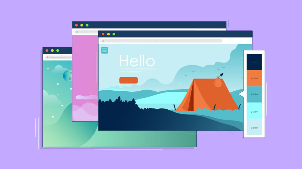
Website Color Schemes
Keep in mind that you’ll have those additional colors, like neutrals for text, background, and other secondary elements. These should also coordinate with your main and accent colors. As you look at your favorite websites, you might notice whites, grays, or variations of the primary colors (light lighter or darker options).
Tools for choosing color schemes
If you need help settling on a final website color schemes, there are lots of tools out there to help you plan.
These website color schemes generators are free and easy to use:
- Paletton
This color palette generator is great because it has several different modes, such as a color blind simulation. It’s useful for seeing how different visitors will view your color scheme, which is especially helpful if you don’t have the ability to do a lot of in-person user testing on the site.
This handy tool is great for testing different colors next to each other. Featuring a drag-and-drop interface, it allows you to not only customize your color palette, but move things around to see what looks best or clashes next to another color.
- Canva’s color wheel
This colorful tool by the Canva team is a great resource for picking out a new palette and for learning even more about color theory! It’ll help you discover different combinations based on those theories, so you know your decision is backed by art and science.
How to apply your colors to your website
Now comes the fun part: Actually starting to implement your website color schemes! Before you get too far, however, it’s important to review a few things to make sure you’re covered on all bases.
Contrast and accessibility
If you’re trying out a few ideas or have a final website color schemes in mind, it’s important to make sure that the website color schemes will work for all users on your site. For example, the contrast between site elements and the background should be enough, so that it is easy for color blind users to distinguish different pieces.
There are a few tools out there that help with this kind of testing, but Contrast Checker is one that is pretty straightforward to use.
Where to use certain colors
After you’ve created your color scheme and tested for accessibility, how do you actually bring it to life? There’s not one set way that works for every project, but there are some helpful things to think about.
A good starting point is to break things down into your primary color, secondary colors, and neutral colors.
- Primary color: This is where the user’s attention goes. Calls-to-action, buttons, and any other important information should utilize the primary color.
- Secondary color: The secondary colors are used to highlight less important elements. Secondary action buttons, less important text, and anything else that doesn’t need immediate attention should be presented in a secondary color.
- Neutral/Additional colors: Neutrals are typically used for text, backgrounds, or anything else that does not need to compete for attention.
Putting all of these colors together will help you create a harmonious website. Then once your colors become established, it’s important that they are used consistently across all marketing channels.
Inspiring website color schemes in 2019
Last but not least, I’ll leave you with a little inspiration to kick off your creative, color-scheme brainstorming!
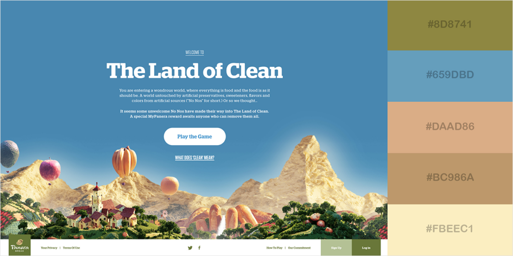
Wokine
This global digital agency has a bold, yet simple color palette that makes use of Pantone’s Color of the Year, “Living Coral.” I love the use of a single primary color (the coral) on top of two neutrals (the light gray and white) to create a minimal design with maximum color impact.
Style Maker Studio
This color scheme leans into the traditional feminine feel that pink can provide, but off-sets it by using black as a bold secondary color (instead of just for text). The color palette is supported with a lighter shade of pink carried throughout as well, for a subtle monochromatic feel.
Jason Andrews
Jason Andrews’ portfolio site is bright and bold, but it’s balanced out by his work: Simple, black and white wireframes (with the occasional pop of blue). While creating this much contrast won’t work for all sites, it’s certainly a memorable experience for his personal brand!
It’ll take trial and error during the web design process to fine tune everything. With a few tips and tricks and a clear plan, it becomes easier to create a website color schemes that works. Being mindful of what is primary, secondary, and where it fits into the design will help your users identify what actions they need to take on your website.